Inspiration
We came to realize that with great growth comes a greater responsibility to recalibrate our vision and re-establish our brand’s value and recognition.
We wanted to take our milestone anniversary as an opportunity
to reconnect with our essence, our values, our partners, and reclaim our story.
Our renewed identity has been designed around the associations with the bird symbol of our logo; namely, a bird’s nest. A nest
is a representation of the love, commitment, and effort we put into building a happy company that is driven to solve. It is a symbol for how we create software solutions – with creativity, agility, and expertise entwined.
Finally, it is a testament to how we build professional yet personal relationships with our partner-clients.
Pillars
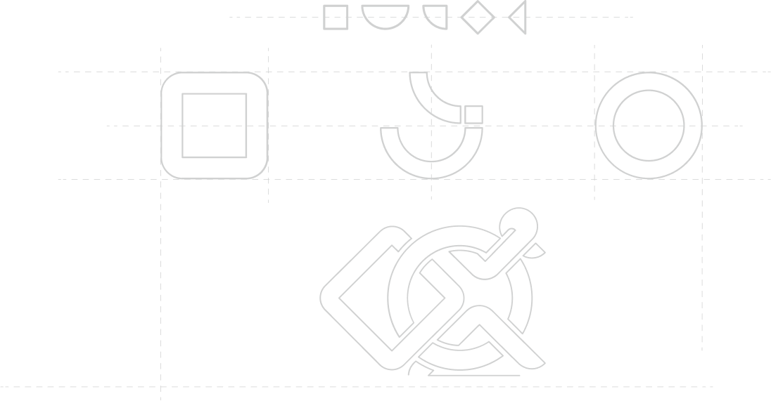
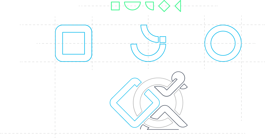
Since our founding in 2006, we have seen the ebb and flow of multiple trends both in terms of technology and in the ways in which companies conduct their business and daily operations. In the process, we were able to select key
areas in software development that we are particularly skilled in, as well as cultivate a company ethos that truly reflects our essence.
We decided to construe our brand refresh story around these concepts, which
we call pillars. They represent who we are, what we stand for, how we go about serving our clients, and how we fulfill our strategy.

We endeavor to help our partner-clients to achieve real, impactful change through technology.

Our most important commitment is our people and the environment we collectively create each day.

We find joy and importance in serving our communities for a better tomorrow.


Tone of Voice
The VOLO voice is evolving to reflect our brand and our audience’s needs. In writing, we are straightforward, insightful, and with heart. We are, above all, humans speaking to humans. Yet, we don’t dumb down our language
to oversimplify our message. We know our audience is clever enough.
We appreciate the power of language, because the way a brand sounds is just as
important as the way it looks.


Color Pallete
We are keeping our Sky Blue and the colors of our logo, which have become an integral part of the VOLO brand. The vibrancy of the Sky Blue is friendly, bold, and optimistic. It brings our brand
to life and helps us cut through the noise. It is most often used in marketing materials related to the People pillar, while the Oxford Blue is mainly associated
with the Business side. Finally, the Spring Green is used for Future-related posts as well as serves as a supporting color.
Additionally, we use the gradients of each color to create
more depth within design elements.
Sky Blue
#01b8ec

Oxford Blue
#333c4e

Spring Green
#3ef78e

Typeface
We’ve chosen a typeface that is as modern as it is elegant and simple, in the best sense of the word. It works perfectly for headlines as well as text for our branding and communication pieces.
Gilroy
Gilroy Black
Gilroy Medium
Gilroy Light
Brand Visuals
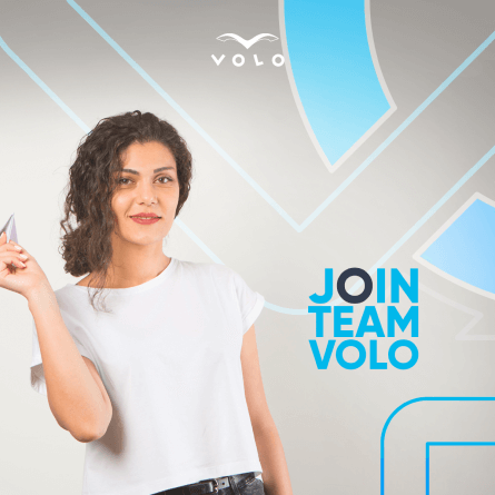
We’ve extended the concept of the nest to our brand visuals as well. Warm and elegant in nature, our visuals not only stand great on their own, but also are an extension and continuation of one another, thereby forming a bigger whole when placed together.




Behind our new look we are still the same dedicated team and company (but much larger and more technically talented), with the goal of providing our partners with the best possible services. We’re incredibly proud of the work that we do at VOLO and thankful for the employees, the partnerships, and clients that have accompanied us in our growth. We owe this rebrand to all of you.
